Designers out there who cut their teeth (or got their first furtive design hard-ons) in the 90’s surely look back, remembering Ray Gun, Speak, Emigre Magazine, etc, and have some mixed emotions. I know I do. I remember the excitement that ethos fostered, the “cool factor” and emotional punch, but 7 times out of 10, upon review, I actually find myself cringing at the designs themselves. A flip through my ragged copy of The End of Print actually gives me a headache. A look at some pieces aping the Carson style, which were many and bad even then, can actually trigger sudden hemorrhagic blindness today.
Recently I was taking my daily stroll through Google books when I cam across a typography title that gave me some laugh inducing flashbacks of ye ol’ 1990’s. I snatched a few screen grabs. Have a look…


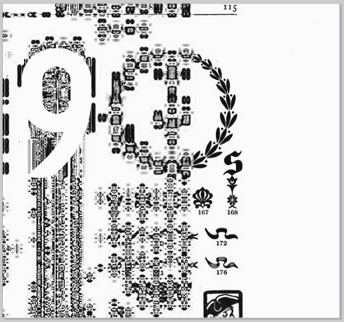
Upon seeing these pages, immediately, images danced in my head of rebellious goateed typographers, crowded into smoky coffee shops, trading unreadable leaflets about how bourgeois semantic content and readability were.
The reason they amused me is because, as the digitally savvy among you already realize, unless there is a disgruntled and unemployable Carson acolyte hiding out in Google’s scanning facility, these images are no more “thought out” designs than the ground around a mulberry tree is a Seurat. They are just digital accidents, ghosts in the design machine. It was only a beautiful coincidence that they happened to appear on a book called Manual of Style, A Compilation of Typographical Rules.
And yet… sad though it may be for those of us whose goatees have since matured into full beards, these brainless computer accidents do hold a certain aesthetic affinity for those “grungy” 90’s don’t they?
Though design styles are cyclical to a degree I don’t expect this one to make a comeback any time soon. As if to underscore this suspicion Google has since caught its error (or caught the Design Van Winkle roaming its halls) and the Manual of Style has been returned to its glorious and banal 1911 readability.
Ah well. Easy kern easy go.
less

This reminds me of the cryingly bad black-on-white wallpapers that were de riguer (mortis) in last season’s Brocade Home catalog, which I and a couple of the other postalborgs were passing around and laughing at. This years’ collection doesn’t hurt the eyes as much since they dialed back the retina-raping black, purple, and green to more muted, survivable tints. http://www.brocadehome.com/bh/index.jsp Adding insult to injury were the fetishistic foot sculptures on vaguely jabberwockish shelves. Those are gone too, Apollo be praised. But even in this year’s catalogue you can see hints of last year’s who-could-live-with-that excesses.
I swear, if you can find last year’s Brocade catalog, look at it. See if it doesn’t look like a parody. A remaining example: notice the wallpaper behind this chandelier:
EEEEEEEEEEEEEK!