It is usually my practice to limit my image posting here to those things which I find pleasing and which I assume you might find pleasing as well. This is only natural. We all like pretty pictures. Today, however, it is my intention to post some decidedly ugly images, images which are so ugly, in fact, that they might correctly be called “the ugliest” images in existence. Don’t fret, they are not close-up proctological photos used for diagnostic purposes. Images of that nature are not meant to be pretty, but rather functional, and in the satisfying of that function do have a certain merit; No, the images I am about to show you were created by human hands to fulfill a purpose (like said proctological images) but to simultaneously be aesthetically pleasing as well. The ultimate statement on their awfulness is that they fail miserably on both counts, which is to say their ugliness is so great that it actually hinders their intended functionality. That is the definition of failure in design I’d say. Brace yourself…


I’m sorry you had to absorb that all in one massive dose but as a person interested in design, and more importantly as a proud owner of both a cornea and an optic nerve, I felt it was my duty to drive home this point: Television weather-infographics are pitifully, horribly, inexcusably bad. These are pieces of design which we seek out every single day for their intended functionality, often first thing in the morning, when we are half asleep and most vulnerable, but which hammer at our eyeballs like Schuster conundrums made of broken neon tubes and melted crayon shavings. I ask this, here and now, of all the television weather-infograpic makers– Why?! Why must it be this way?
Television infographics in general are pretty much out of control so far as I can see. Their scrolling, swirling, swooping gloss has at this point far overpowered the meager amounts of information they are meant to shuttle efficiently into our brains. They do not, if I had to put a totally fabricated number on it, contribute in any way to that purpose 75% of the time. They are the gaudy prefabricated ornament on the facade of pure televised information. Howard Roark would dynamite your satellites! Well, were he a real person… who was able to fly… into space… carrying one of those old-timey plunger boxes… Anyway what I’m saying is from sports broadcasts to news broadcasts the infographics are poorly thought out, overused, detrimental to effective transference of data, and did I mention spectacularly ugly?
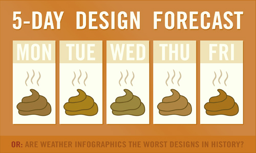
As for weather graphics in particular I just can’t help but wonder, where did networks get the idea all that crap was necessary? It seems like presenting the weather forecast ought to be quite a simple operation. Temperature and precipitation projections for 5 days. Why all the confused hubbub? Best as I can surmise there are only two possibilities– meteorological hubris or graphical incompetency. Perhaps a combination of both.
If there are any young people out there reading this who are enamored by the glitzy and glamourous life of a television weather graphics professional and are planning on making a career of it, let me offer these few tips:
1) Nothing needs to move. Not raindrops, not snowflakes, not wind marks, not sun-rays. We already know how rain and that other stuff works.
2) Remember there are other colors besides ultramarine blue, pure red, and neon yellow. Use them, but please not all at once.
3) Don’t try to get to clever and “nuanced” with your atmospheric icons. All we need to know is whether it’s sunny and dry or cloudy and wet, the numbers fill in the rest. Having one icon with a single cloud, another with two slightly more wispy clouds, and a third with a darker more rounded cloud does not help us at all. If you want to interpret weather conditions in sensitive and unique ways paint landscapes.
4) Go to design school, take a few courses at the local community college, or at very least have lunch with your highschool art teacher a couple of times. Please?
5) One word: Standardization!
This last would go a long way in cutting down on the eye contusions. If we could just agree on a few simple symbols which would hereafter represent important weather conditions things would be a lot easier. If weather icons were standardized a symbol and two numbers would deftly tell us all we needed to know. No need for interpretation.
Well, hope you feel gratified, my having finally voiced this displeasure which I know was secretely eating away at all of you. Sometimes there is such a thing as too polite you know? That’s how you get ulcers.
Next time: Shampoo bottles!

