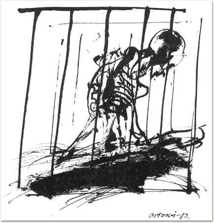
An Illustration for Kafka’s Ein Hungerkünstler (The Hunger Artist) by Andrzej Ploski, circa 1983, which struck my fancy. You can see the full series, as well as Ploski’s illustrations for many of Kafka’s short works here. Note that the stories appear in their Polish translation. If you don’t read Polish but would like to read the corresponding stories as well I can recommend The Kafka Project.


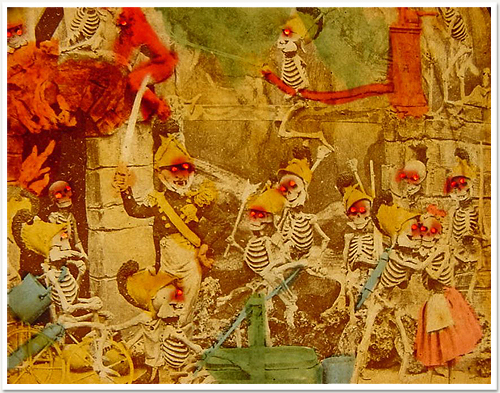
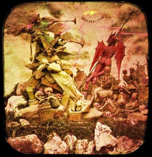
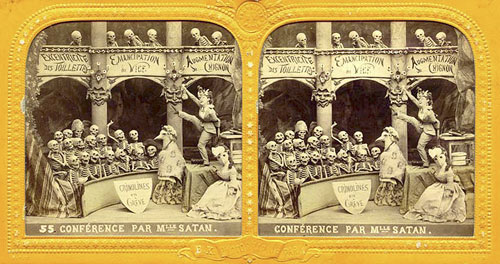
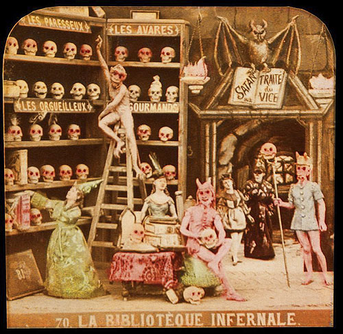
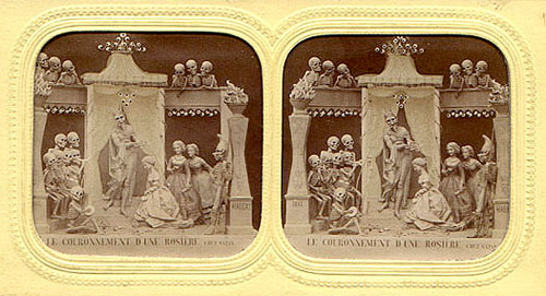
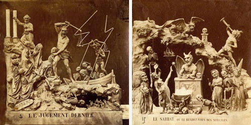
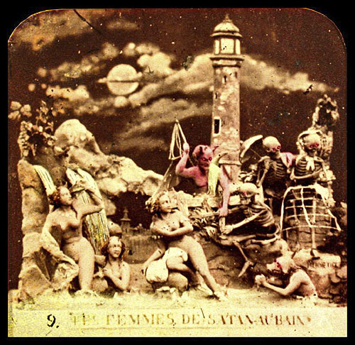
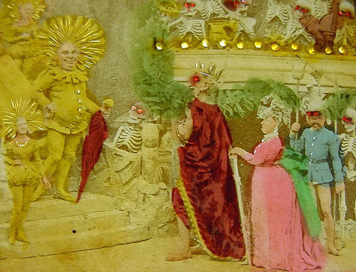
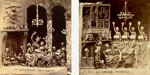
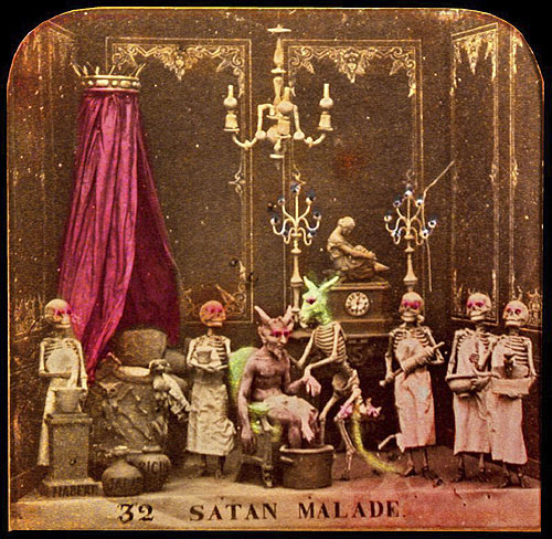
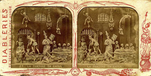
Diableries
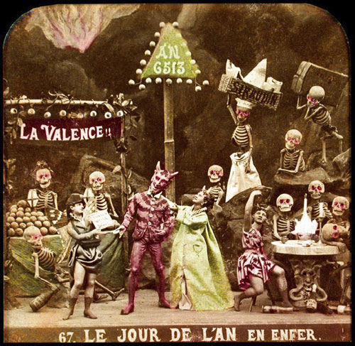
Their history, method of creation, and purpose are largely a matter of speculation. They originate from some time in the 19th century and are French. They were created by only a handful (perhaps 2 or 3) artists. It seems they were photographed from small clay dioramas, none of which have survived. They were presented as opaque stereo-photographs and transparent rear-projection tissues, some hand colored (as above) some a rich sepia. The mystery surrounding their origins was likely intentional in that there content, humorous and bawdy and dealing almost exclusively with satan, hell, and the dead, would likely be seen as heretical. The present thinking is that they were produced as social satire on the regime of Louis Napoleon Bonaparte who, as Napoleon III, was Emperor of France from 1852 to 1870. The relative anonymity of the creators and mystery of their origins would serve as protection against imprisonment and other dungeon-related unpleasantness. See below for a few scant examples and links to more complete resources.

There is Yet Another Hell
Mention historical Japanese painting to a westerner and certain images involuntarily leap to mind- Hokusai’s great wave, an idyllic nature scene, an elegant Geisha, a sparrow perched on an inky branch… even Tales of the Genji or an explicit bit of Shunga perhaps. I imagine one thing which does not readily spring to mind is H-E-Double-Hockey-Sticks, with its demons and leaping flames and pestilence and writhing souls. After all, that’s our thing! Isn’t it?


Zengraving
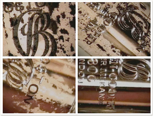
Came across this hypnotic video of master hand engraver Steve Lindsay completing an engraving from start to finish. It’s pretty amazing. As a designer (with the prerequisite appreciation of typography) watching someone carve perfect, beautiful letter forms from metal, and so handily, is both humbling and fun. As a (lapsed) painter I can certainly appreciate the brute hand-skill involved. Beyond that there is a definite Zen quality inherent, I’d say, to any work which denies the luxury of an eraser or undo button. Pour yourself a glass of something (the vid is accompanied by an urbane soundtrack of classical and jazz) and enjoy.
For more videos, images, and information on hand engraving see the following:
Engraving School.com, Lindsay Engraving.com, and Master Engraver.com.

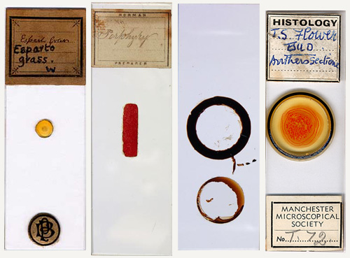
Beautiful Specimens
Wikipedia tells us: “A microscope slide was originally a ‘slider’ made of ivory or bone, containing specimens held between disks of transparent mica. These were popular in Victorian England until the Royal Microscopical Society introduced the standardized microscope slide in the form of a thin sheet of glass used to hold objects for examination under a microscope.”
I’d like to add the following: Antique microscope slides, looked at from a strictly aesthetic standpoint (egged on by a design obsessed brain obviously) are some of the most elegant and perfectly beautiful human artifacts on planet earth. You can quote me on that. See below for irrefutable
aesthetic evidence.


Nature Vs. Art
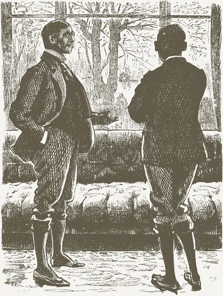
Æsthetic Friend: “Yes, This room is rather nice, All but the window, with these large blank panes of plate glass! I should like to see some sort of pattern on them—Little squares or lozenges or arabesques…”
Philistine: “Well, but those lovely cherry blossoms, and the lake, and the distant mountains, and the beautiful sunsets, and the purple clouds—isn’t that pattern enough?”
(Taken from Punch, or the London Charivari, Vol. 102. June 4, 1892. which, along with many other volumes, can be found on Gutenberg, listed for your ease here.)

The work of master goldsmith Giovanni Corvaja is a fascinating mixture of the ancient and the cutting edge. His pieces are strikingly modern in form, clean geometries encasing staggering complexities, but the techniques employed to create these works are in fact the re-imagining of 3000 year old Etruscan methods (filigree and granulation) largely forgotten⊕ until very recently.
Quote, “Rockets, canoes, bagpipes, fish, good old chaps with patches on their elbows and jokes about Derrida: Glen Baxter’s world is always instantly recognizable. Blunt, innocent-looking lines tether its extravagant surrealism to the page like guy ropes, the economy of those pen strokes undermined by the accompanying text, blocked out in hand-written capitals, which sheds often surprising light on the dummy-blank expressions of the characters.” from an old Guardian article called King of the surreal. Anyone whose work contains multiple Giacometti jokes, or indeed a constant stream of art gags, gets the nod in my book. So let me ask you, are you, like myself, an admirer of this Glen Baxter by any chance? Well, you are about to become one.
Links: Glen’s homepage, Thorogood, Modernism Inc, The Tate, Flowers East, Int. Herald Tribune piece, and a short audio interview.

“Redhead or Blonde?” The Opthalmologist by Jose Perez
The above (picturing a decidedly unorthodox color blindness test) is from a series of whimsical, satirical paintings by artist Jose S. Perez. Collectively titled Perez on Medicine the 29 separate pieces each focus on a different medical specialty. The whole series, which was initially published as a book in 1993, is presented online at The National Library of Medicine site. Each plate includes a written interpretation as well as initial pencil studies. Very nice.
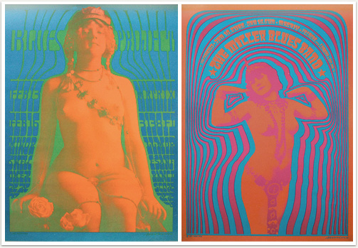
Chances are when you conjure in your mind’s eye an image of a “psychedelic” 60’s rock poster (whether for fun or because you’re an ex-hippie flashing back involuntarily to your blocked-out youth from within the soft leather comfort of your Mercedes) you are likely, without even realizing it, envisioning a Victor Moscoso. It’s been said that Moscoso “was the first of the rock poster artists with academic training and experience.” He studied at the Cooper Union and at Yale (under Josef Albers) and it shows. Moscoso’s own style is, at this late date, damn near synonymous with the form in the same way that you think “band-aid” when you envision of a little adhesive-backed bandage. Likewise though Robert Crumb went on to be the most famous underground artist of the era I guarantee when you think of Zap Comix you think of Moscoso’s dancing mr. peanut / mr. penis cover. I don’t think it’s overstating it to say Moscoso’s style was aped and absorbed by the culture to a such degree that it just seems to be a force of history in retrospect rather than the inspired work of a really talented designer.
To see and read more try: Fine Arts Museum SF, the Neon Rose series & Victor Moscoso at Wolfgang’s Vault, the Victor Moscoso poster gallery, more Neon Rose, the music machine, an interview at the Comic’s Journal, Liberatore: A portrait of the artist as a counterculture connoisseur, and 1960s Psychedelic Rock Concert Posters and the Broadening of American Spirituality.