The above (picturing a decidedly unorthodox color blindness test) is from a series of whimsical, satirical paintings by artist Jose S. Perez. Collectively titled Perez on Medicine the 29 separate pieces each focus on a different medical specialty. The whole series, which was initially published as a book in 1993, is presented online at The National Library of Medicine site. Each plate includes a written interpretation as well as initial pencil studies. Very nice.

“Redhead or Blonde?” The Opthalmologist by Jose Perez


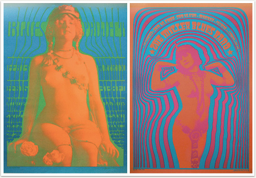
Chances are when you conjure in your mind’s eye an image of a “psychedelic” 60’s rock poster (whether for fun or because you’re an ex-hippie flashing back involuntarily to your blocked-out youth from within the soft leather comfort of your Mercedes) you are likely, without even realizing it, envisioning a Victor Moscoso. It’s been said that Moscoso “was the first of the rock poster artists with academic training and experience.” He studied at the Cooper Union and at Yale (under Josef Albers) and it shows. Moscoso’s own style is, at this late date, damn near synonymous with the form in the same way that you think “band-aid” when you envision of a little adhesive-backed bandage. Likewise though Robert Crumb went on to be the most famous underground artist of the era I guarantee when you think of Zap Comix you think of Moscoso’s dancing mr. peanut / mr. penis cover. I don’t think it’s overstating it to say Moscoso’s style was aped and absorbed by the culture to a such degree that it just seems to be a force of history in retrospect rather than the inspired work of a really talented designer.
To see and read more try: Fine Arts Museum SF, the Neon Rose series & Victor Moscoso at Wolfgang’s Vault, the Victor Moscoso poster gallery, more Neon Rose, the music machine, an interview at the Comic’s Journal, Liberatore: A portrait of the artist as a counterculture connoisseur, and 1960s Psychedelic Rock Concert Posters and the Broadening of American Spirituality.
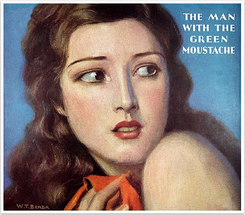
Yes ladies, by all means, draw your shawl near to yourself and beware The Man With the Green Moustache! There is no telling where it, or he, has been! This image was taken from an extensive and beautiful collection of magazine covers stretching, mainly, from the 1890’s through the 1940’s. (Via / If you scroll down you’ll see the full menu.) It is presented by a site dedicated to Ellis Parker Butler, with each of the magazine covers representing an issue which contained his work. Unfortunately the story of the dreaded “green moustache” was penned by someone else, so we’ll most likely never know its wonders. The site offers a few Ellis-penned surrogates though in the form of some similarly mysterious sounding men like- The Man Who Did Not Go to Heaven on Tuesday, The Man Who Murdered a Fairy, The Man Who Was Someone Else, and The Man With the Glass Front in their reading room.
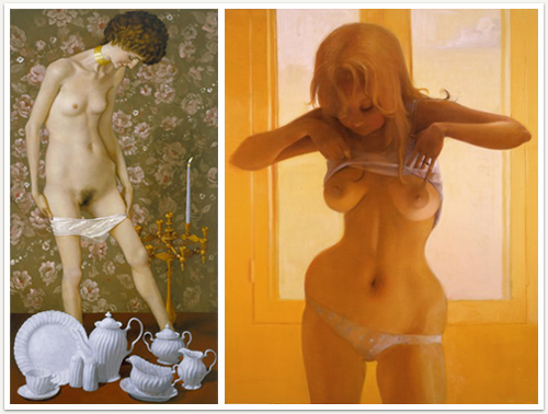
Quote, “John Currin’s new show draws a sharp distinction between sex and sexiness. There is more explicit erotic action on view than in any images hitherto by this avid courter of controversy, and there is sexy paintwork to boot. But, instructively, you don’t find both in the same places… A controlled, super-knowing nastiness used to typify Mr. Currin’s bodies — women with sagging, almost tumorinflicted posteriors, absurd basketball busts, and protruding, bony hip joints — and still comes across [in some pictures]. But there is a different dynamic between Mr. Currin and chinaware. If anything, the elusive, recalcitrant objects inflict a certain cruelty on the artist trying to fix them to the canvas while getting across their homey American rococo.” From an interesting piece by David Cohen over at Art Critical about Currin’s new show at Gagosian.
Meanwhile over at David Zwerner Lisa Yuskavage has a new show (looking for all the world like it was separated at birth from a group of Julie Winter character sketches for Sam Kieth’s The Maxx.)
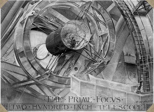
Russell William Porter (1871-1949) was an architect, explorer, mapmaker, watercolorist, and pioneer in the field of “cutaway illustration.” As though this were not an impressive enough skill-set Porter was also an ameture astronomer and telescope builder, sometimes referred to as the “founder of amateur telescope making.” It was presumably this wonderful intersection of talents which lead astronomer George E. Hale to recruit him to work on the design of the 200-inch telescope on Mt. Palomar (for a time the largest telescope on earth). During its conceptual development Porter produced 19 beautiful drawings of the instrument, which amazingly (considering their technical depth and exactitude) were all done before the telescope was actually constructed using only blueprints as a guide. The Prime Focus, from this set, is pictured above.

Reintroducing: Hella Basu
Picked up a 1980 design annual today put out by the venerable (but soon after to fold) U.K printing house Penrose. In it I found many amusing bits about then state-of-the-art computer graphics technology, articles of interest to the design dork with a historical bent, purty pictures, etc. The most striking bit by far, however, was a feature on a calligrapher by the name of Hella Basu. Beautiful work which put me in mind of everyone’s current fave Marian Bantjes, except Basu was born in 1924. A subsequent internet search for information on her work came up empty. Judging by the samples in the feature that’s a real shame. It’s my pleasure then to reintroduce her here, on the web, with the following 10 pieces culled from the Penrose annual.


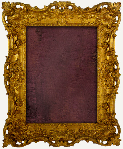
The Picture Frame
Or: the humble boundary between Art and reality
Recently I went on the hunt for some reference on picture frames and a trip to the Strand rewarded me with The Art of the Picture Frame by Jacob Simon. It was created to accompany an exhibition of the same name held at the National Portrait Gallery (UK) in 1996. Looking through the book It dawned on me instantly that I actually had no idea whatsoever what the history of the picture frame was, or indeed, why frames were invented in the first place. Since I picked up the book I’ve been intending to do a post on the origins of the frame. A concise summation of the info contained within the book, however, would be prohibitively difficult so instead I’ve decided to simply share some of the frames themselves and offer, instead of a summation, some related links. See below.


The death of the White Goddess
Or: The Meerschaum Pipe.
Admittedly pipe smoking has long since passed its peak of popularity. The days of gentlemen sitting in their book-lined studies puffing at a fine pipe whilst sipping at a tumbler of brandy are long gone, thrown out with the servants, the wife-ruling, the mistresses, and the dishwater. With them so too has passed the glory days of the pipe carver. Sure there are stragglers, both smokers and carvers, but I’d wager that today most pipe smoking is done sans tobacco and I think anyone who has ducked into a head shop, out of need or curiosity, can attest to the fact that pipe craft now strives to fulfill a different set of demands, and adheres to a very different “aesthetic.” So, digging now into the “dying arts” file, I bring you some images and some history of the once great meerschaum pipe.


Art for sale
Or: At long last your waiting (for an original Jaime Morrison photograph to hang lovingly on your wall and cherish for ever and ever) is over!
I’ve decided to make available a group of 13 photographs I shot early last year. Most were shot in Central Park. All are professionally mounted, to bleed, and meant to be hung without a frame. They are photographic enlargements, not digital prints, without augmentation, cropping, or retouching of any kind. There are two sizes in the group. 12 of the photographs measure 20"x30” and are mounted on .75” thick museum board. The remaining 2 are quite large, measuring 48"x72”, mounted on 1.5” thick museum board. Each is a first edition original, having only been printed once to date. If you’d like to know about their inspiration you can see this short statement which I wrote shortly before they were exhibited. See below for thumbnails of each photograph and feel free to contact me with any inquiries.

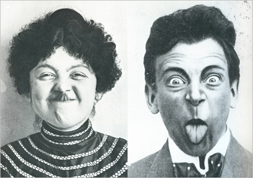
The two vintage postcards above express in image more concisely than I ever could in words just exactly how I’m feeling today. They sum-up nicely the faces that I would be making at you right now if this site were, well, my face. They come from a book put out sometime around 1975 called Fantasy Postcards which reproduce a selection of vintage, turn of the century, specimens from the author, William Ouellette’s, personal collection. Since I have nothing to say today (and would rather make ugly faces at each and every one of you if only I could) I’ve decided to simply offer unto you, oh slavering maw of the internet, a few of the wacky cards which caught my eye. Enjoy.


