
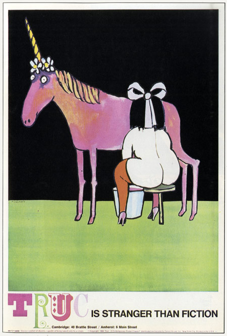
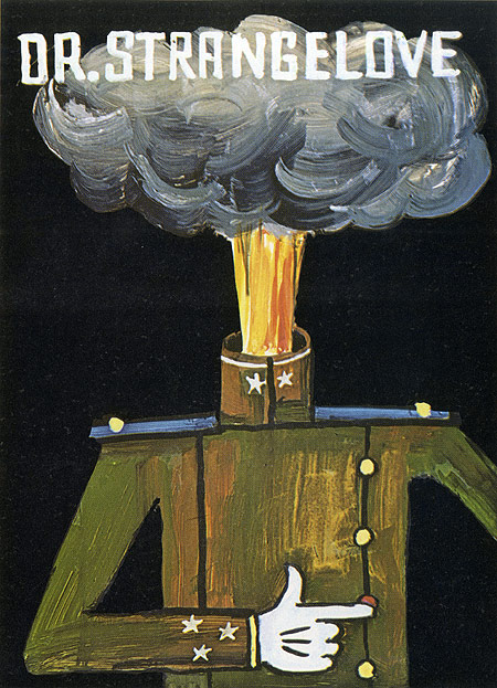
Tomi Ungerer’s work, along with that of a handful of others, might rightly be considered to not only embody the design style of the 60’s and 70’s, but to have played a central part in that style’s ascendence. Throughout those decades Mr. Ungerer’s work was everywhere, encompassing everything from politics and commercial concerns to erotic publications and children’s books. He was prolific, and in no realm more so than in that of the poster.
As it happens just yesterday I came across the perfect resource to illustrate that point, the 1971 book The Poster Art of Tomi Ungerer, compiled and edited by Jack Rennert. Below I’ve reproduced, for your viewing pleasure and Mr. Ungerer’s glorification, a small sampling of the terrific poster work contained therein. Have a look…


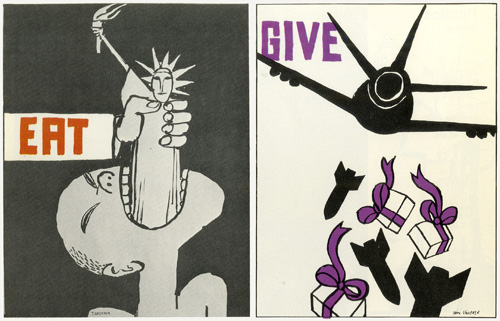


Quote: “Expect the unexpected” is a fitting description of all of Tomi’s posters. The element of surprise, the element of the absurd, is a clear constant in his posters. When Tomi is finished with a poster design, he will step back a bit, and if he’s really satisfied with what he’s done, he’ll say, “It’s absurd!”
This very absurdity, achieved by elements of surprise and exaggeration, makes for a good poster: one of the key elements of a good poster is that it be arresting, that it be immediately compelling. This propensity for gleefully combining the improbable with the absurd is carried through in all of Tomi’s works.” -Jack Rennert.


Quote: “Hans Pflug, writing about Tomi’s work when he first came to the United States, noted: ‘His drawings and advertisements all give the impression of having occurred to him in a flash, and of having been captured on paper with equal immediacy.’ To watch Tomi at work is to know that this was an accurate observation and is still so. What is amazing to me, is that Tomi at once gets a complete image of what he wants to do, and putting it down on paper becomes almost the automatic reflex of his clearly ‘seen’ image. He rarely goes back over his lines. They are immediately, cleanly, and finally, put down on paper. He may not be satisfied when he’s finished and will throw the whole thing out, but he’ll seldom redo or rework his lines or colors.” -Jack Rennert.


Quote: “The main influences in my work were, as a child, Mathias Grunewald, Durer, Schongauer, as well as Hansi and Schnugg, both Alsatian illustrators. Later came Goya, Bosch, the Japanese graphists (Hokusai, etc.), the old issues of Simplicissimus, and Wilhelm Busch.
My high school records were crowned with the final remark: ‘Perverse and subversive.’
My interest and hobbies vary and alternate: flying kites and balloons, old toys, books, bondage, erotica, minerology, botany, medicine, jazz-the list is vain and endless. My most meaningful author is Louis Ferdinand Celine, my favorite painter is Ingres, and Bach’s is just about the only music that gives me total satisfaction.” -Tomi Ungerer, from the introduction to The Poster Art of Toimi Ungerer


It was no easy task choosing what to include here but I hope you enjoyed these.
You can visit Tomi Ungerer’s homepage if you’d like to see some more of his work.
Also I’ve posted a small set of pieces Mr. Ungerer created for a 1966 IBM exhibition called Some Computer ABC’s over at the Nonist Annex.
Lastly, in that I was unable to find anything comparable on the web—the horse’s mouth and all that—I wanted to offer the full text of the biographical sketch Mr. Ungerer wrote for the introduction to the book. You can read it here.
hide full text


Flipping fantabulous, Nonist.