
Everyone loves Saul Bass. It’s a deserved love. He’s a design giant and designers pay the respect due. But even those amongst us who don’t get hot under the collar for fonts and logo treatments love him, whether they know his name or not. They love his his incredible title sequences for films like The Man with the Golden Arm, Vertigo, and Anatomy of a Murder. I recently came across some commercial work he’d done for television in the 50’s, and upon doing some google-sniffing to search out more information, was surprised to find none of it was already represented on the web. With that in mind please consider the following images my small contribution to the digital remembrance of all things Bass.
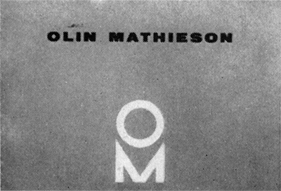
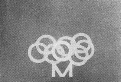
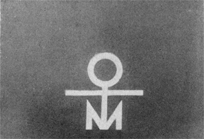
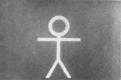
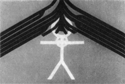
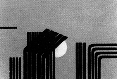
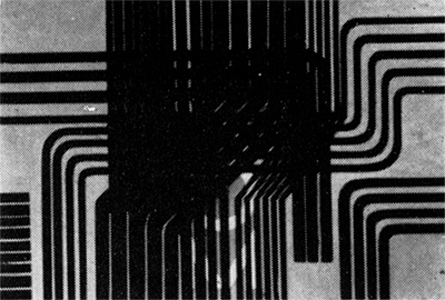
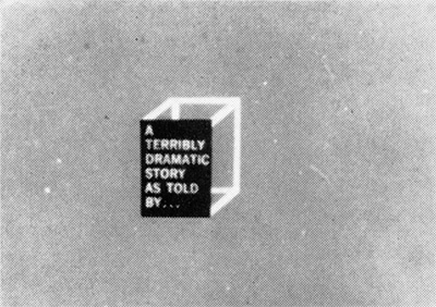
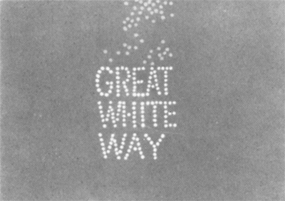
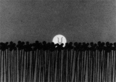
This first sequence was a “corporate presentation for television” (read: mini-commercial) created by Bass for the Olin Mathieson Chemical Corporation. It appeared at the beginning of the series Small World, which the company sponsored. Its goal was “to indicate the firm’s range of activities through symbols.” Saul handled the animation and it was put out by Playhouse Pictures.


You can see the entire sequence in one large image by clicking here.
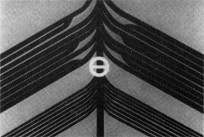
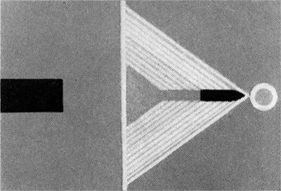
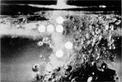
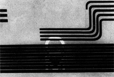
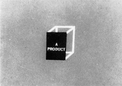
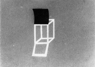
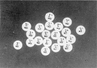
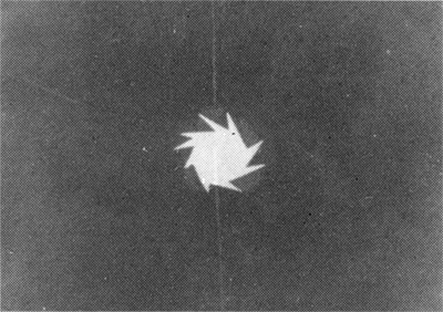
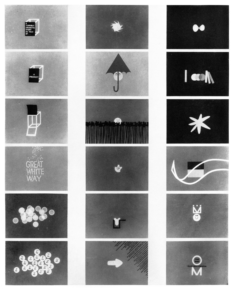
The second sequence was also created for Olin Mathieson Chemical Corporation. This time the “corporate presentation” focused on the companies range of packaging materials and their “functional suitability.” Again Saul handled the animation and it was put out by Playhouse Pictures.


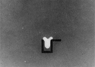
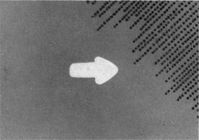

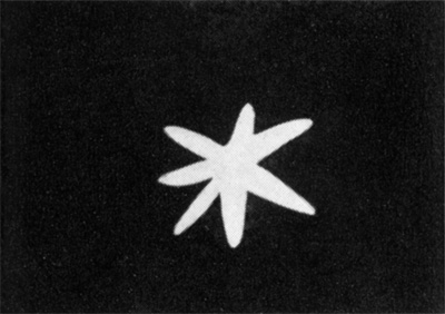


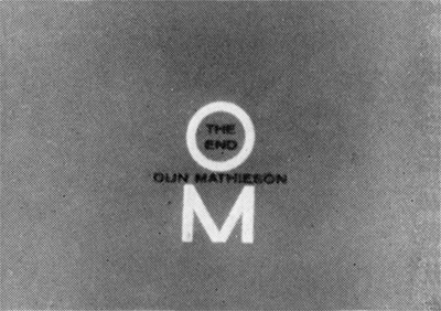
You can see this entire sequence in one large image by clicking here.
It’s hard to really get a sense of these mini-commercials from a handful of stills, to tell whether they were “successful” as corporate presentations, whether they were fun, or catchy, or memorable. I suspect that they were.
It’s interesting to see, even on this limited level, how Saul approached that task which has been seemingly omnipresent since the beginning of direct advertising- making giant corporations which manufacture things like blasting powder, gunpowder, ammunition cartridges, and and endless array of deadly chemicals seem cuddly and approachable, or at very least human. This is a task advertising agencies still wrestle with today, with often cloying and nauseating results. (Think petroleum, defense, tobacco, and pharmaceuticals.)
I believe beyond his unquestionable talents Saul actually had a built-in advantage over those that wrestle with the task today. The 50’s and 60’s were an era in which the friendly, “cartoony,” hand-drawn illustration was king. King I say! It was a visual language and style that could make damn near anything seem wholesome. ⊕
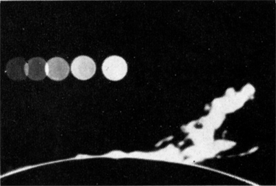
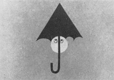
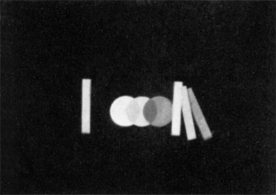
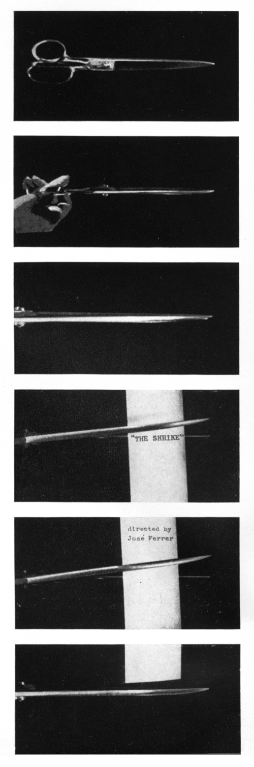
Lastly, as a tiny bonus let me offer a few scant shots from the title sequence for the film The Shrike which Mr. Bass did and which seem to be absent from the internet as well. Here you go.
Anyhow, hope you completeists and design-folk found some pleasure in that. To the rest of you- better luck next time.
Note: all of sequence images above were scanned from the book, Design In Motion by John Halas and Roger Manvell, published 1962.

