I’ve noticed, in my long years of toiling wage slavery, that certain products created exclusively for corporate consumption, specifically those products meant to be used in office kitchens and bathrooms, are, shall we say, “different” from their consumer level counterparts. These are purely functional items whose exteriors fall somewhere between the total austerity of military issue and the frenetic high-gloss of supermarket fare. These are items not aimed at individual consumers and so most pretense of friendliness is absent. Fittingly they eschew all up-beat and desire-kindling market-speak, employing instead the dry, litigation-resistant language of the work-place. Strangely, however, these products still maintain evolutionary vestiges of graphic design once meant to please and comfort end-users. These are products in a grey limbo of package design. They inevitably exhibit an odd, inelegant, half-hearted sort of aesthetic which seems almost to originate from a different culture or, indeed, a whole other era.
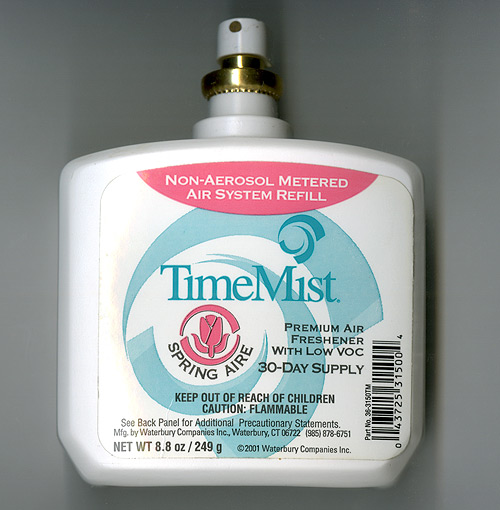
Speaking of which, take a closer look at the example product pictured above…
Does anything strike you as particularly odd or comical about this Non-Aerosol Metered Air System Refill?
It strikes me that the confluence here of everything I outlined in the first paragraph, a sort of perfect synchronicity of the graceless handling of dry language combined with the use of vague, indeterminate, graphical elements, lead to an absolute miracle of accidental product misrepresentation…
In an attempt to simplify (and create a brand name from) the straight forward descriptor “Timed Mist” the letter “d” is dropped. The resulting text is then layered over top of a meaninglessly unspecific but decidedly vortex-like swirl graphic.
Yielding?
Well it’s unquestionably a spray which not only freshens the air, but which in some arcane manner bends or warps or splits or pierces or otherwise modifies the very fabric of Space-Time!
Amazing!
When I saw this product I laughed, but my brain, like a poorly behaved brat-child, instantly clamored for a small graphical addition to the label, “oh please, oh please, come on, oh please,” and who am I to refuse my darling brain anything?

Now that is package design I understand!!! At my brains request I took the liberty of mocking-up a label for the reverse-side as well (I spoil him, I know.)

Fuck yeah!
less

A few sprays can probably fix that leaky time gap I had last year…