
I was looking through a Linotype specimen book today from 1920, glancing at the faces, the advertising figures, some info on “the Rogers Tabular Matrix,” that sort of thing, when I came upon a page in the “miscellaneous characters” section which made me pause. It was a page titled “party emblems” and featured icons meant to represent 10 separate political parties. I thought, “In 1920, less than a single lifetime ago, there were 10 political parties in America taken seriously enough to warrant a logo?” My my, how times have changed.
Linotype was a hot-metal typesetting process, remember, so each of these images had to be carved, made into a mold, and cast in lead for use. Which is simply to say there was some actual effort involved in making them available. Yes folks, in the storied past even clip-art had to walk 20 miles, uphill, in the snow, to get anywhere.
I realize, of course, that these images were almost certainly not “official” logos and that they were likely just pulled from the vast storehouse of imagery Linotype had at their disposal. But the very fact that, in an election year, they chose to offer symbols for 10 possible parties means that there was enough demand to warrant a supply. Linotype is still going strong after all so I think we can trust their business acumen.
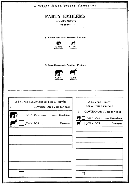
In any case here is the page-

Nice of them to set up a sample ballot wasn’t it?
Interestingly as it turns out their example here was not to different from the ballot that citizens saw in the Presidential election of that year. There were, in fact, candidates from 7 different parties represented. Granted the 5 who were not Democrat or Republican only garnered 5.5% of the vote as a group… but still.
If I were to update their page for the present day (taking demand into consideration when formulating our supply of course!) it might as well look like like this-
That’s no fun is it?
Now in the interest of full disclosure for those of you who weren’t paying close attention the last time around, in 2004 there actually were at least 10 parties represented on the ballot.
“10 you say?!”
Yes, 10. Minus the obvious those parties were the Libertarian, Constitution, Green, Socialist, Peace and Freedom, Prohibition, Christian Freedom, Socialist Equality, Workers World, and the Personal Choice Party.
Sounds just positively bustling and vibrant doesn’t it?
It doesn’t look so vibrant unfortunately. I mean when was the last time you saw the logo for the Socialist Equality Party emblazoned on one of the 20 massive HD screens which are continuously swirling and pulsating behind Wolf Blitzer on The Situation Room? In fact, now that I think of it, have you ever seen any of their logos anywhere? ⊕
Are you thinking what I’m thinking?
This sounds like a job for Linotype! They can dig into their vast stores of imagery once more for the American electorate and bring forth handsome and heroic emblems which in one bold stroke typify all that the parties stand for… these emblems can pepper posters and banners and bumper stickers across the entire expanse of this great nation and the ideals for which… oh wait, that’s right, there is no demand. Sorry.
These parties already have logos obviously, ⊕ it’s just that so few people care that we’ll never see them. “Miscellaneous characters” indeed.
Setting aside the socio-political ramifications of this essentially two-party system, let’s just say that from a visual standpoint it would seem we the people are stuck with the same dull, uninspiring,
elephant show.
Which brings me, finally, to the issue that I’m certain is gnawing at the young and idealistic designers reading this, who, like teary-eyed children listening to their parents discuss a dead puppy from the top of the stairs, are wondering about the those poor cast-aside logos from the 1920 Linotype catalog, which having once symbolized grand ideals now seem so hopelessly lost in the wilderness…
Let me just say this, you sweet and gentle kids- cry not!
Cry not for the Eagle or the 5 Pointed Star! Cry not for the Fountain or the Book or the Moose! Nay child; cry not for the Torch, the Scales, the Bell or the Strong Arm because in America… in America we graphics professionals see to it that no logo is left behind!

There. Feel better? Good. Now here’s some warm milk, off to sleep with you, daddy’s got a whole lot of whiskey he needs to swallow.

