So I managed to get my grubby hands on yet another vintage Graphis Annual, this one, a loner, representing 71 / 72. The book and its contents are beautiful, as always, though stylistically this books represents a bit a of a shift from the late 50’s issues I’ve showcased thus far. (See parts 1, 2, and 3.) I’ve limited the post to 18 examples, drawn from nearly all of the 20 subject groups, simply displayed in the order they were scanned. Before we get to It here are a few words from editor Walter Herdeg…
“Our society relies for its existence on the consumer behavior of its members. And consumption depends on– inter alia –advertising. Is this yearbook of advertising graphics, then, concerned with our society? Is it, indeed, a critical commentary on society? We leave the reader to form his own opinion.”
By: Hitoshi Morishima / Carl Seltzer / Lou Jrimkess. Poster for an exhibition of Japanese advertising art in Las Angeles. Gold Seal, Red Sun.
By: Milton Glaser. Poster for new Olivetti Typewriter. (I must say if there is one thing I’ve noticed looking through old Graphis Annuals it’s that Olivetti consistently has some of the best work. In this case it’s no surprise considering the designer of course.)
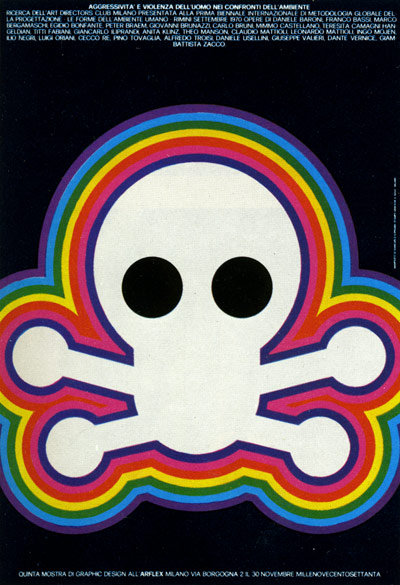
By: Giancarlo Iliprandi. Poster for an exhibition of graphic design in Milan on the theme of aggression and violence.
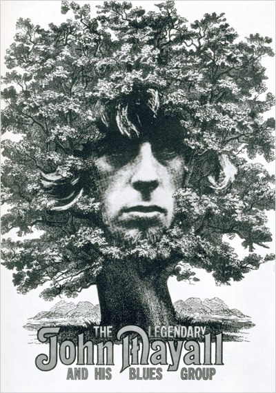
By: Gunther Kiesre. Poster for blues group.
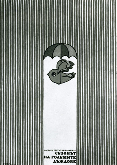
By: Dimitar Tassev. Poster for theater performance for young people. Polychrome bird, blue ‘rain.’
By: Hrnryk Tomaszewski. Poster for theater performance. (Were “rock and roll hands” already a “thing” back then? Or was this play about a starving horse which died, in rigor, on its back?)
By: Enrich Huguet. Advertisement for a new diuretic.
By: Arnold Varga. Newspaper ad for avant-garde clothing from John Wanamaker dept. stores. (Very avant! I’d love to wear a giant body-covering lion head to work.)
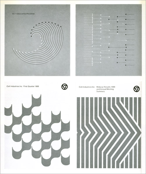
By: Dietmar R. Winkler (top) / Arnold Saks (bottom). MIT booklets / Business reports for Colt Industries.
By: Jane Wright / Warren Webber / Don Trousdell. Double spread mailer about umbrellas issued by the Beckett paper company. (Fucking brilliant. Umbrellas are the focus, disguise mustache, bowler, lucky clover, etc, the “accessories.” Love.)
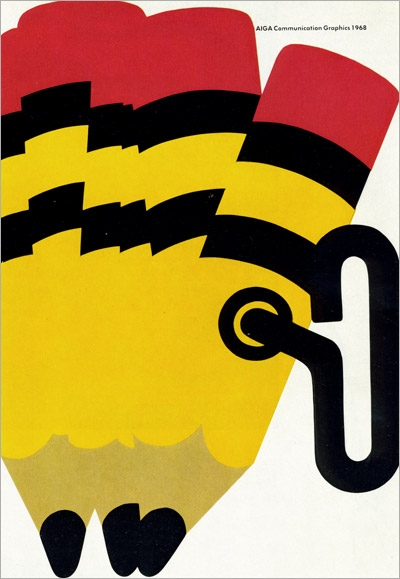
By: Peter Bradford. Catalog cover for an AIGA graphic design exhibition. (For confused youngsters and 21st century graphics professionals: those yellow things are called “pencils.”)
By: Currie & William Haines. Illustration from an annual report for VSI Corp. who was active in the aerospace industry. Polychrome on blue ground.
By: Roman Cieslewicz. Cover of magazine TY I Ja. Polish.
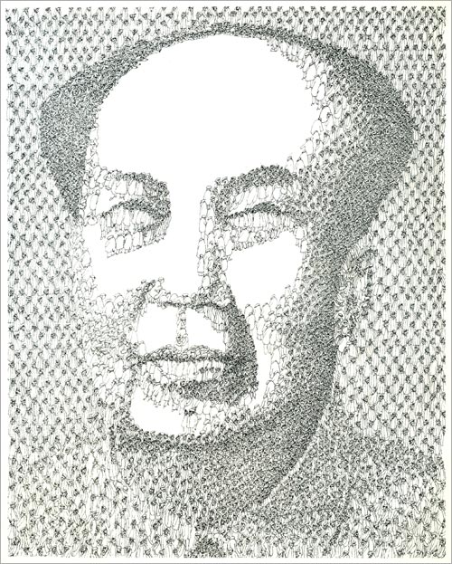
By: Hans-Georg Rauch. Cover for Der Spiegel featuring “Mao’s new revolution.”
Detail of Der Spiegel cover above.
Charles Goslin / David Barnett. Covers for the magazinebedside Nurse. (Look very modern don’t they? But the bigger question “Bedside Nurse magazine?!”)
By: Kohei Sugiura. Front and back covers of Marketingram, the Shiseido house organ, here dealing with the morphology of the human head.
By: Ron Hughes. Cover for a record about ecology. (Gore could have used this for An Inconvenient Truth 35 years later.)
By: Tomi Ungerer. Air-India Poster.
As always these were just the examples that caught my eye, not necessarily perfectly representative of the state of design and illustration in 71 / 72.
This annual had an added bonus in the form of an introduction by one Paul Rand, a fella you designey types might have heard of. I decided rather than chop his text up into little quotes in the post I’d just make the whole thing available as a pdf, and here it is: Paul Rand Intro to Graphis Annual 71 / 72. Enjoy you design dorks.
More to come.


.jpg)


