
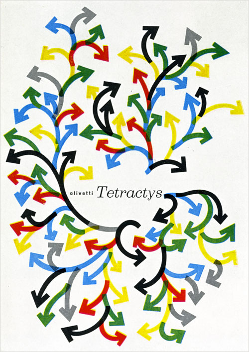
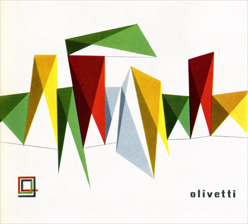
As promised, here I will continue with my series on Graphis Annuals of years past (previously: ‘59/60 parts 1, 2, 3 and ‘71/72). This time I’ll be presenting some material from the 1957-58 edition. It’s not my favorite year but it’s an interesting year because you can see the past and future jostling for position. Though much of it feels distinctly 50’s some of the 60’s advertising style that would soon overtake everything was already making inroads. Below I have culled 22 images for your perusal, so happy perusing.
The issue begins with an introduction by Charles Rosner which I’ll spare you the bulk of. It does strike me as disrespectful and lazy somehow to not at least offer a few words, however, for context’s sake. So here is a single paragraph to get light your way forward.
Quote: “As for the impact [of advertsising] on society: the economic implications are closely linked up with deep-rooted inferences. The ‘social function’ of advertising is to stimulate wants, to make people dissatisfied with the little they have, and to work harder and earn more. Yet this function—to stimulate dissatisfaction—is relatively recent, for the goods people want, the auto, the washing machine, the radio, the television, electric iron, dishwasher, are all products of the lasty forty years or less. All this is part of the transformation, of the Western world at least, to a high-consumption society. There is more advertising in the United States not because salesmanship is a peculiar American virtue, or vice, but because of the comparative opulence of the country. As Professor Galbraith has written, A hungry man could never be persuaded that bread that is softened, sliced, wrapped and enriched is worth more than a cheaper and larger loaf that will fill his stomach.” —Charles Rosner, Graphis annual ‘57/58.


I only wish these older volumes had more plates printed in color!
Lastly I’d like to leave you with a final paragraph from the annual’s introduction. In our internet age with Tumblr and Flickr and Ffffound it seems as relevant as ever, weather some of us like it or not.
Quote: “The public is demanding more pictures and fewer words. American housewives want a lot of pictures and little copy. They want the picture to tell the story. Ideas expressed in art can do more and reach more people than any other form of communication. Witness the picture magazines, the great decrease in text in all advertising, the outdoor poster, television. The eye has a far better memory than the ear and the advertising man who is in tune with the times will seldom want for an idea.” —Charles Rosner, Graphis annual ‘57/58.
So there you have it. Until next time.

