Elevator lady, elevator lady, elevator lady, elevator lady…................. Levitate me.


Quote, “In the beginning was the Word. There was a little pond and in the pond was a little letter “O”, a word. Soon the pond was full of trillions of O’s, happily mouthing their meaning. And the word was fruitful and multiplied. Then something happened. An “O” changed to an “I”. Another changed to an “A”. (Others changed to “x” and “p”, but these were not fruitful and were, sadly, deselected.) Soon, the pond was swimming with O’s and A’s and I’s. The I’s, in particular, thought they were something special, but the O’s were happy just to be noticed…” Zachriel’s Sea of Beneficence, part of the larger Word Mutagenation.
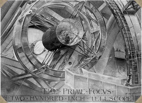
Russell William Porter (1871-1949) was an architect, explorer, mapmaker, watercolorist, and pioneer in the field of “cutaway illustration.” As though this were not an impressive enough skill-set Porter was also an ameture astronomer and telescope builder, sometimes referred to as the “founder of amateur telescope making.” It was presumably this wonderful intersection of talents which lead astronomer George E. Hale to recruit him to work on the design of the 200-inch telescope on Mt. Palomar (for a time the largest telescope on earth). During its conceptual development Porter produced 19 beautiful drawings of the instrument, which amazingly (considering their technical depth and exactitude) were all done before the telescope was actually constructed using only blueprints as a guide. The Prime Focus, from this set, is pictured above.

Reintroducing: Hella Basu
Picked up a 1980 design annual today put out by the venerable (but soon after to fold) U.K printing house Penrose. In it I found many amusing bits about then state-of-the-art computer graphics technology, articles of interest to the design dork with a historical bent, purty pictures, etc. The most striking bit by far, however, was a feature on a calligrapher by the name of Hella Basu. Beautiful work which put me in mind of everyone’s current fave Marian Bantjes, except Basu was born in 1924. A subsequent internet search for information on her work came up empty. Judging by the samples in the feature that’s a real shame. It’s my pleasure then to reintroduce her here, on the web, with the following 10 pieces culled from the Penrose annual.


Night of the Ground Stars
Or: urban shoe-gazing finds a purpose
Electric light, Concrete, and Chewing Gum, what have they in common? Though, admittedly, both concrete and chewing gum can ultimately trace their roots to antiquity, all three of these items, in something akin to their modern form, entered the American stage in the 1870’s.
Edison invented the first commercially successful incandescent lamp around 1879. At the Centennial Exhibition in Philadelphia in 1876 David O. Saylor exhibited the first American made portland cement, though it was not until 1891 that the first concrete street in the United States was paved. Thomas Adams opened the first chewing gum factory in 1870, and a year later Adams’ chicle based New York Gum went on sale in drug stores for a penny apiece. By the beginning of the 20th century all three of these items had become popular and were on their way to being staples of American life.


“It is only possible to succeed at second-rate pursuits - like becoming a millionaire or a prime minister, winning a war, seducing a beautiful woman, flying through the stratosphere or landing on the moon. First-rate pursuits - involving, as they must, trying to understand what life is about and trying to convey that understanding - inevitably result in a sense of failure. A Napoleon, a Churchill, a Roosevelt can feel themselves to be successful, but never a Socrates, a Pascal, a Blake. Understanding is ever unattainable. Therein lies the inevitability of failure in embarking upon its quest, which is none the less the only one worthy of serious attention.”
-Malcolm Muggeridge.
The Picture Frame
Or: the humble boundary between Art and reality
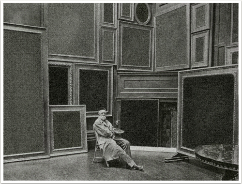
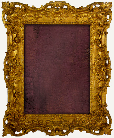
Recently I went on the hunt for some reference on picture frames and a trip to the Strand rewarded me with The Art of the Picture Frame by Jacob Simon. It was created to accompany an exhibition of the same name held at the National Portrait Gallery (UK) in 1996. Looking through the book It dawned on me instantly that I actually had no idea whatsoever what the history of the picture frame was, or indeed, why frames were invented in the first place. Since I picked up the book I’ve been intending to do a post on the origins of the frame. A concise summation of the info contained within the book, however, would be prohibitively difficult so instead I’ve decided to simply share some of the frames themselves and offer, instead of a summation, some related links. See below.


Normal: the romanticized average
What percentage of the time is the concept of “normalcy” referenced in relation to human fears I wonder?
I am wary of the adjective “normal,” as I’m sure many people are, when used to describe anything other than geometric relationships or chemical solutions. It is a dishonest sort of adjective I think, seeking, at worst, to describe something which does not exist, or, at best, to pretty-up something which does exist, but which ought to be called by another name entirely.

I am about a third of the way through Jeff Vandermeer’s newest novel Shriek: An Afterword and am enjoying it immensely. I’ve been a fan of Jeff’s works since first getting a whiff of City of Saints and Madmen way back when. Shriek is an incredibly satisfying book thus far, with a unique structure that fractures time, as so many contemporary “post-modern” narratives do, but in an altogether more intimate and rewarding way. I won’t say anymore since this isn’t a review, I haven’t even finished the book yet after all, but anyone interested in more in depth reviews can see the following: SFCrowsnest, Shaken & Stirred, or Infinity Plus. What I wanted to share with you tonight was something entirely more specific, a short section that might very well represent the greatest book rejection ever put in print. With Jeff’s kind permission I will reprint it for you below.

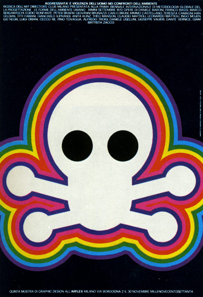
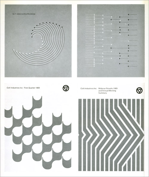
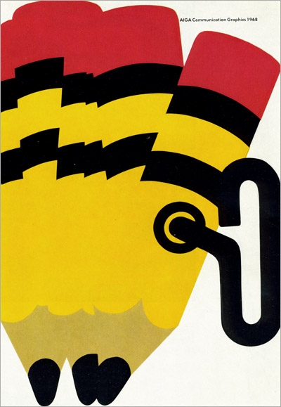
Graphis Annual 1971 / 1972
So I managed to get my grubby hands on yet another vintage Graphis Annual, this one, a loner, representing 71 / 72. The book and its contents are beautiful, as always, though stylistically this books represents a bit a of a shift from the late 50’s issues I’ve showcased thus far. (See parts 1, 2, and 3.) I’ve limited the post to 18 examples, drawn from nearly all of the 20 subject groups, simply displayed in the order they were scanned. Before we get to It here are a few words from editor Walter Herdeg…
“Our society relies for its existence on the consumer behavior of its members. And consumption depends on– inter alia –advertising. Is this yearbook of advertising graphics, then, concerned with our society? Is it, indeed, a critical commentary on society? We leave the reader to form his own opinion.”


.jpg)


