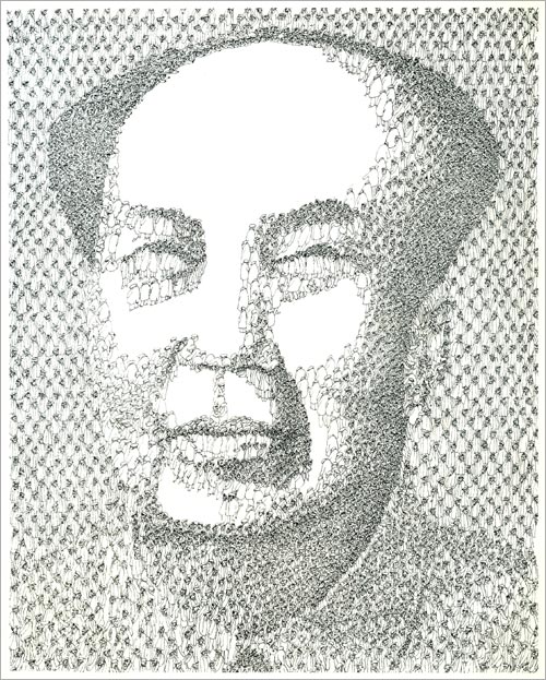
Picked up a 1980 design annual today put out by the venerable (but soon after to fold) U.K printing house Penrose. In it I found many amusing bits about then state-of-the-art computer graphics technology, articles of interest to the design dork with a historical bent, purty pictures, etc. The most striking bit by far, however, was a feature on a calligrapher by the name of Hella Basu. Beautiful work which put me in mind of everyone’s current fave Marian Bantjes, except Basu was born in 1924. A subsequent internet search for information on her work came up empty. Judging by the samples in the feature that’s a real shame. It’s my pleasure then to reintroduce her here, on the web, with the following 10 pieces culled from the Penrose annual.

Reintroducing: Hella Basu


Graphis Annual 1971 / 1972
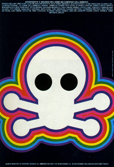
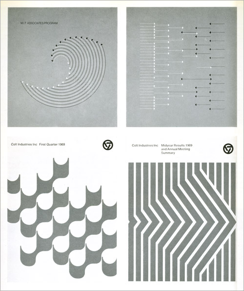
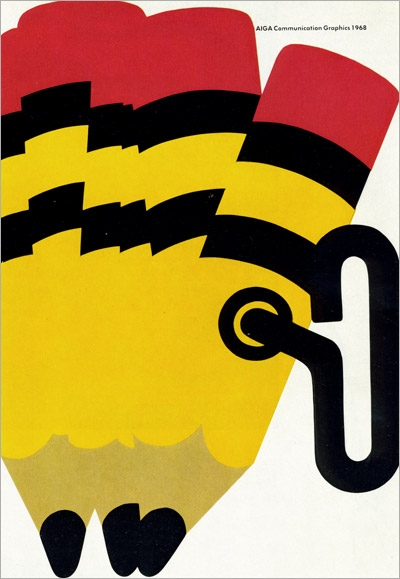
So I managed to get my grubby hands on yet another vintage Graphis Annual, this one, a loner, representing 71 / 72. The book and its contents are beautiful, as always, though stylistically this books represents a bit a of a shift from the late 50’s issues I’ve showcased thus far. (See parts 1, 2, and 3.) I’ve limited the post to 18 examples, drawn from nearly all of the 20 subject groups, simply displayed in the order they were scanned. Before we get to It here are a few words from editor Walter Herdeg…
“Our society relies for its existence on the consumer behavior of its members. And consumption depends on– inter alia –advertising. Is this yearbook of advertising graphics, then, concerned with our society? Is it, indeed, a critical commentary on society? We leave the reader to form his own opinion.”


.jpg)


It is usually my practice to limit my image posting here to those things which I find pleasing and which I assume you might find pleasing as well. This is only natural. We all like pretty pictures. Today, however, it is my intention to post some decidedly ugly images, images which are so ugly, in fact, that they might correctly be called “the ugliest” images in existence. Don’t fret, they are not close-up proctological photos used for diagnostic purposes. Images of that nature are not meant to be pretty, but rather functional, and in the satisfying of that function do have a certain merit; No, the images I am about to show you were created by human hands to fulfill a purpose (like said proctological images) but to simultaneously be aesthetically pleasing as well. The ultimate statement on their awfulness is that they fail miserably on both counts, which is to say their ugliness is so great that it actually hinders their intended functionality. That is the definition of failure in design I’d say. Brace yourself…


The death of the White Goddess
Or: The Meerschaum Pipe.
Admittedly pipe smoking has long since passed its peak of popularity. The days of gentlemen sitting in their book-lined studies puffing at a fine pipe whilst sipping at a tumbler of brandy are long gone, thrown out with the servants, the wife-ruling, the mistresses, and the dishwater. With them so too has passed the glory days of the pipe carver. Sure there are stragglers, both smokers and carvers, but I’d wager that today most pipe smoking is done sans tobacco and I think anyone who has ducked into a head shop, out of need or curiosity, can attest to the fact that pipe craft now strives to fulfill a different set of demands, and adheres to a very different “aesthetic.” So, digging now into the “dying arts” file, I bring you some images and some history of the once great meerschaum pipe.


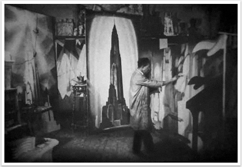
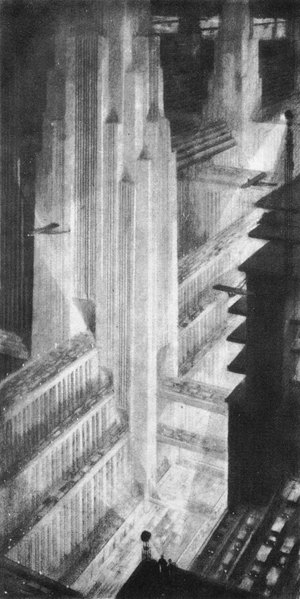
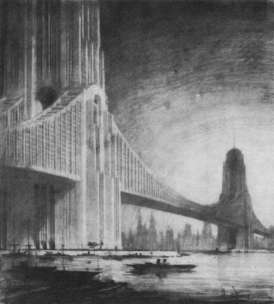
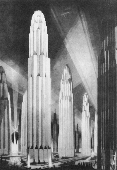
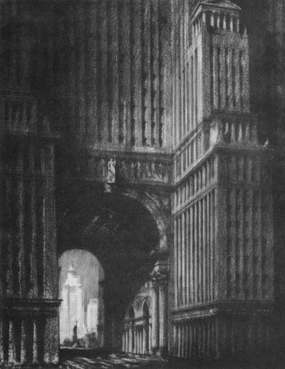
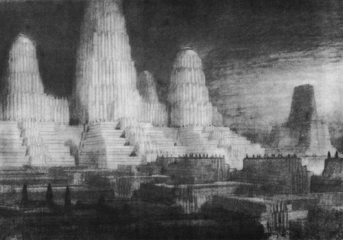
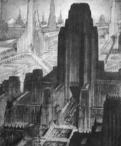
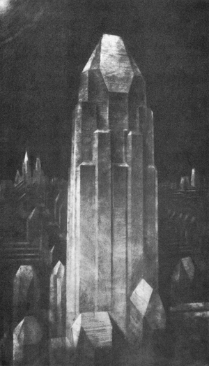
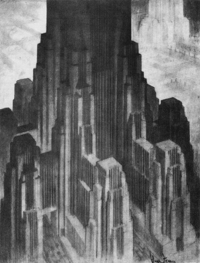
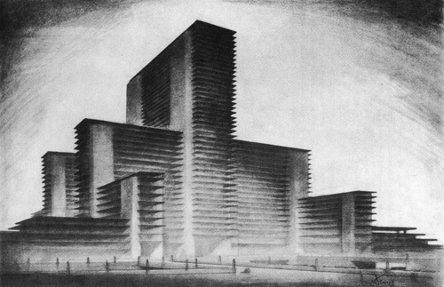
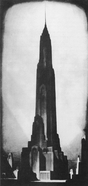
Hugh Ferriss: Delineator of Gotham
Or rendering “The Vertical Sublime”
Picked up a reprinting of a 1929 book by Hugh Ferriss titled The Metropolis of Tomorrow. Ferriss was the preeminent architectural draftsman of his time who through his moody chiaroscuro renderings of skyscrapers virtually inventing the image of Gotham visitors came to the city to see and residents identified with so fondly. As Michael Mallow puts it: “By the mid-twenties, renderings by Ferriss had become almost de rigeur for successful competition projects; countless skyscrapers waited their turn to be bathed in the dark monumentality emanating from his drafting table. In these works a blasé department store appears as a giant lording over its block. Stodgy hotels cease to be stodgy hotels and become looming silhouettes emerging from the urban haze like shipwrecks. Ferriss went to grand new lengths in suppressing detail for mood, and clients loved it.”


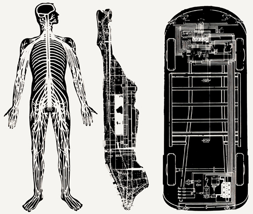
City Metaphors from the vaults of the Cooper-Hewitt
What follows are four plates from architect O.M. Ungers’ City Metaphors which were included in a larger exhibit on view in 1976 at the Cooper-Hewitt called MAN transFORMS. It was the kick-off show of the institutions’ rebirth as the Smithsonian Institution’s Nation Museum of Design. I’m lucky enough to have procured the exhibition catalog, which is just chock full of goodies, and the tiny taste which follows are taken from it’s pages.

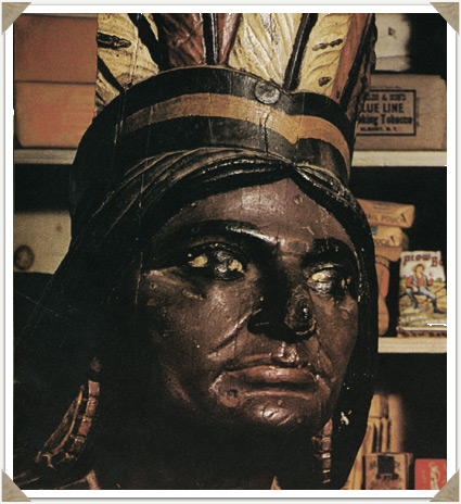
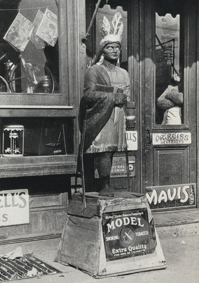
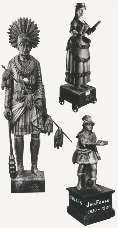
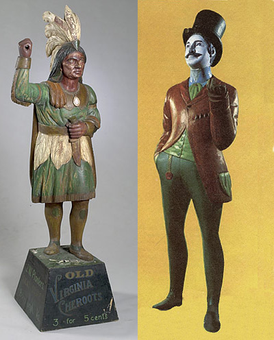
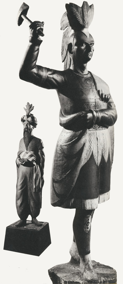
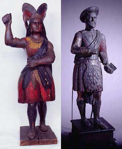
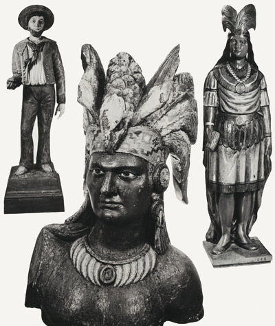
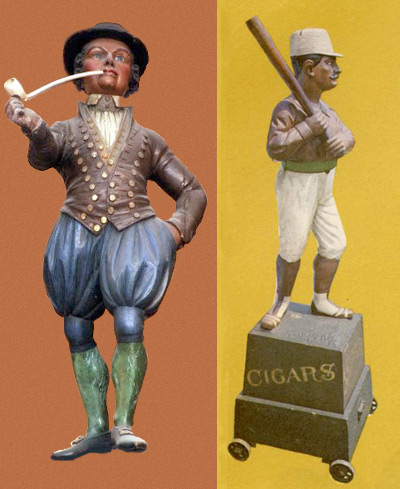
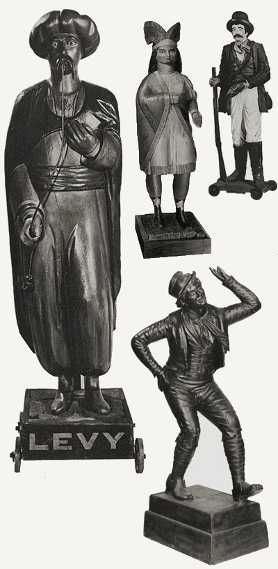
The Image Business and the Wooden Indian.
Scotch-Irish, Brits, Africans, Italians, Native Americans, Russian Jews, Germans, Greeks, Slavs, Armenians, Chinese, Poles, etc, etc. This was the glorious melting pot of 19th century America, only this melting pot had not been on the stove long, and the ingredients had not yet congealed into anything approaching a smooth consistency. Imagine the difficulty in trying to do something as simple as buy a cigar.

Notes from on the ground
or: the what and why.
So after a redesign period of over a month I’m back. And what do I have to show for it? Well, you’re soaking in it. This is it. This is the new face of the Nonist. I can imagine what might be going through some of your minds on first sight- “No header image? No giant logo? No sidebar? No blogroll? No nav-bar? One column? What the hell?!” The design savvy among you might add “No image replacement? No ‘holy grail?’ No liquid or elastic? No yellow fade effects?” Some of you might even take this train of thought further down the line and arrive at- “It took a month to design this?”
Believe me when I tell you, I’m as surprised as anyone at where the redesign ultimately landed. If you’ll indulge me I’d like to talk a little about the process which got me here, explain the reasoning behind my decisions, and lay out a few of the changes…
And so that, as they say, is that. This is the new Nonist, an attempt at elegance in form and readability in function. As stated I’m not yet certain whether I’ve succeeded in these attempts, but for better or worse it’s done. We hear over and over that content is king. This new site is set up such that it will sink or swim on its content alone. Its a self-imposed challenge for me to craft some fine quality goodies because if I don’t there won’t be much else to look at.
I’m sure there will be hiccups and necessary tweaks (as such I encourage you all to let me know if you encounter problems). There are also a couple sections I’m still planning on launching (a gallery, a forum, a store, etc) but truth be told I’m sick of looking at code. So we’ll just take it all as it comes. Now all that remains is to see if I can remember how to blog. Here’s hoping.
hide full text
⇐
| page 4 |